Showing posts with label art. Show all posts

Monday, May 26, 2014

What if your aesthetic doesn't match the actual work you produce?

So, I'm having sort of a dilemma right now.  It's not keeping me up nights, but it's on my mind a lot.

I have a bunch of time to be creative right now, and I don't want to squander it.  I'm having loads and loads of ideas--so many that I have to jot them down the moment I have them so that I don't lose them in the onslaught of more ideas.  Some of those are gardening ideas.  A bunch are creative nursery ideas (but if I work on those now, will I jinx the process?  If we're totally unprepared will we get a baby really quickly?). But a bunch are also illustrations and book ideas and toys and pillows.

My desk--that I'm trying to keep so so so clean--keeps getting littered with little scraps of paper with ideas on them.  It's great!  And a little overwhelming.

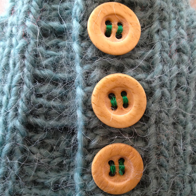
Here's the actual dilemma, though.  My aesthetic is really pared down, the simplest structure and line work as possible--just enough detail that some other person can understand the thing I have made.  My toys have eyes, but never mouths. I like big color fields.  My favorite color is all greys but the lightest versions that slip into pastels.  I hate pastels. I love all things natural as design elements, but also as textures (don't try to sneak polyester or rayon or Splenda or margarine on me.  I can always tell).  I believe that children's toys should appeal to them, but also to the adult that they will become, and I think they should fit into the decor of their family's home--wood blocks, naturally colored dolls.  And everything I make should be enduring.  It's construction and appeal should last.

But sometimes when I sit down to draw, it all gets really complicated or the colors are whacky.  I start with the idea that I am going to follow the things inside of me that define how I judge taste and the objects I allow in my house, and 20 minutes later, I've not followed any of those rules.  What's up with that?
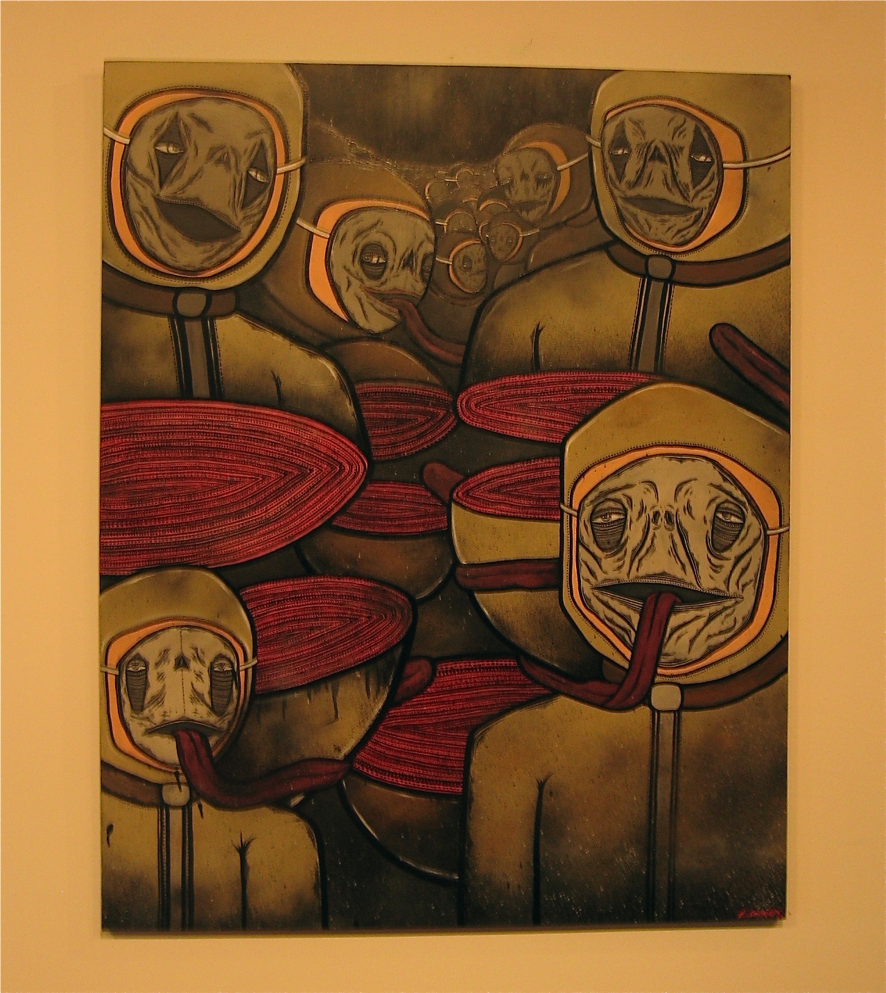
These are slices of a series of heads I have created.  What?  I like them, but how do they get me to where I actually want to go? I don't have this problem with the dolls I make.  I buy yarn and fabric in colors that appeal to me.  But something about drawing digitally. . . there are so many options and cool things to play with.

So, help me/us out.  How do you create within the bounds of your aesthetic?  Does it just happen naturally or do you have to make a conscious effort to constrain yourself?  Where do our aesthetics even come from?  And do you think we can live two aesthetics--the aesthetic of what we create and the aesthetic of what we consume?

And maybe most importantly, is it important to have one strong look and feel for your work?  
 
I struggle with that. I love that when I see illustrations by Mercer Mayer that I can always recognize them.  But I also think it's pretty cool that there are Frank Lloyd Wright homes in Oak Park that you would never recognize as his designs if they weren't on the registry.

What if you want to try out loads of different "looks and feels" in your art work?  Is that a lack of commitment? Or is that unfettered creativity?  I don't know.

I'm not sure I can only still be having this conversation with myself. . . Thanks in advance for chiming in!

Tuesday, February 25, 2014

Lightening the Load

Is there a day that listening to a band that includes a harmonium, banjo, and xylophone can't improve just the tiniest bit?

You be the judge:


Thank you, Freelance Whales.

That is all.

Sunday, March 3, 2013

Toy Sweaters


I have been in serious toy-making mode.  Working on a few gifts, but mostly just making a heap of critters that will eventually end up in the fivetrees shop.  I enjoy making the animals' heads and picking the colors of their underclothes.   But in the end, I think I most love making their tiny clothes-sweaters, dresses, pants, scarves, and then styling their teensy outfits. 
 

There are so many small choices to make and the detail interests me--down to the color thread I use to sew on buttons.  (I believe strongly that it should never be the same color as the actual garment, except in specific extraordinarily limited situations. . . )


Monday, August 13, 2012

happy. sad.


Went to the Art Institute with my mom and aunt and in the hall on the way to the textile installation and the Lichtenstein show, I saw this ridiculously loveable cutie lion (my new favorite object).  Other end of the hall to balance things out was this grumpy disapproving head.

Saturday, July 14, 2012

Nice Things on Nice Walls

"Nice Things on Nice Walls" is a three-artist show currently on view at Columbia College Chicago in the Hokin Gallery of their 623 S. Wabash Building .  I believe the artists are a mix of current students and alumni and it's on view until this coming Friday, July 20th.

And because I went to see the show initially with my friend Jill (I've been back twice).  She is the owner of the Clodfelt elderly couple and I am the proud owner of the photo of children BFFs.


It's a show filled with talent. . . and my favorite?  A sense of humor.

A few pieces by Don't Fret


Eric Lundquist


Pete Clodfelter


And because I went to see the show initially with my friend Jill (I've been back twice).  She is the owner of the Clodfelt elderly couple and I am the proud owner of the photo of children BFFs.

Saturday, June 23, 2012

Kilian Martin and the Beauty of Abandoned Places

I'm not what you would call a skateboarding fan. Most of the time, it's the sort of thing that doesn't even register. . . not until a kid cruises by me on the sidewalk, arms arcing and cutting the air around him, or when we visit friends in Logan Square and see the kids in the murk and deep of the skate park under I-90. But this video is beautiful and sad and nostalgic and filled with grace. Art lives where art can. . .

Tuesday, June 19, 2012

More Reasons Why Columbia is Cool

This past Saturday, after Anniversary brunching with Dan, we started wandering north to the Art Institute. . . but didn't get very far.  Why?  Because we caught Columbia College Chicago and its students being their usual amazing selves.

For example, what do continuing Columbia students do in preparation for the arrival of brand new students?

Paint giant welcoming murals. . . duh.


 (hehehehe.  i heart corn.  that was totally me 13 years ago. . . )


PLUS, Right upstairs in the very same building, Columbia was hosting The Chicago Alternative Comics Expo.  And it was amazing.  


Dan and I spent more money than we should have (based on our bank account balances), but less money than we wanted to (based on the talent in the room).  And Dan got to meet Sarah Becan face to face.


Sunday, June 17, 2012

We Licht It Up at the AIC


This blog post title is in honor of my honey who thought an awesome ad campaign for the Art Institute's Roy Lichtenstein retrospective could involve--with slight lyric changes, of course--Kiss's "Lick It Up."  My husband is funny, singing "Licht It Up" through the Asian artifact wing. .  .

Anyhoo, the show was good. . . though I wasn't allowed to take pictures of the giant Composition Book (my fave).  So, I took pictures of Engagement Ring (in honor of our anniversary day). . .


this Radio (which was Dan's favorite early on)


Modern Painting with Bolt (which D and I both liked and agreed would make a great album cover)


And then these. . . Seascapes . . . which I think are unceasingly terrible.


More than a decade ago, Casey and I went to go see a Monet retrospective.  In a lot of ways it was fascinating--seeing haystack after haystack after haystack or water lily after water lily after water lily.  You could see measurably how light and time of day altered the subjects of his painting and likewise, how age altered his sight and what he produced.  But, man, early on in the show, there was this whole set of bubblegum pink garden/cottage scenes.  They were commissions.  They were hideous.  They looked like starving artist paintings you'd buy in a parking lot for $29.95.  Casey and I were beside ourselves, giggling, poking fun, and we got shushed by a set of middle-aged women who gave us a brief lecture on respecting genius.  Gah.  Monet was a genius, but that work was not.

That's what seeing Lichtenstein's Seascapes reminded me of. . .

Saturday, April 21, 2012

618 S. Michigan Ave

The Fashion Studies Department of Columbia College Chicago has moved fully into 618 S. Michigan Ave.  And not surprisingly that means that the storefront windows of that building are consistently filled with a revolving collection of awfully brilliant student fashion work.  Sometimes the work there is so far along the fine art spectrum that I just want to stare it as art, but often the work makes me covetous.  I want to buy it and wear it and make it my own.

But the windows are spectacular. Walking to meetings or to go get coffee in the morning, it's fun to watch passersby drawn in to get a closer look.  It's a wide sidewalk there and it's not hard to notice the beelining to the collections on display.

Most recently, there was a collection of historical designs made entirely out of paper.


Thursday, January 19, 2012

Address Is Approximate

Holy cow. A friend (the incomparable Jill Huntsberger) showed me this video.

Completely beautiful.

Address Is Approximate from The Theory on Vimeo.

Created by the U.K.'s Tom Jenkins of the The Theory. Thanks so much for this uplift today, Mr. Jenkins.

Wednesday, August 10, 2011

New Art for Me!


I bought a painting today and it looks like this:


(can you hear me squealing and making little clapping motions just below my chin in delight?)

It's a painting by a Canadian artist from Toronto who has a shop on Etsy called greasychickenface. This is a teensy painting--just 4"x3"--but I love it and it will be perfect to smoosh into my salon-style grouping of art in my office/studio. It's great having new inspiration in there.

Anyhoo. . . greasychickenface's art is great. Colorful and that kind of artwork that's some unusual mix of cute/sad/ugly/playful that makes me sort of nostalgic for how I saw the world as a kid. You should check the shop out!

Sunday, May 15, 2011

Manifest 2

At the kick-off, students competed for $500 in a hack-your-t-shirt competition. I hack my t-shirt every year, and I like to think that I inspired this. . .


Theatre students at the start of what can only be called the prettiest and most joyfullest kick-off to Manifest in its ten year history.


This was my favorite piece in the Book and Paper Arts gallery. . . A gorgeous handmade map of the world made of handmade paper. . .


The PGA (Please Generate Art) a "putt-putt golf course" built by Columbia Graduate Students. I think I hit a ball once and the rest was more like an art/golf course-themed maze. . . like a haunted house, but not scary? It was great. Giant rats, trees filled with legs, a room teeming with dancers, wrapping up in a tea party and a chance to add to a giant painting. It was funny and clever and well put together.